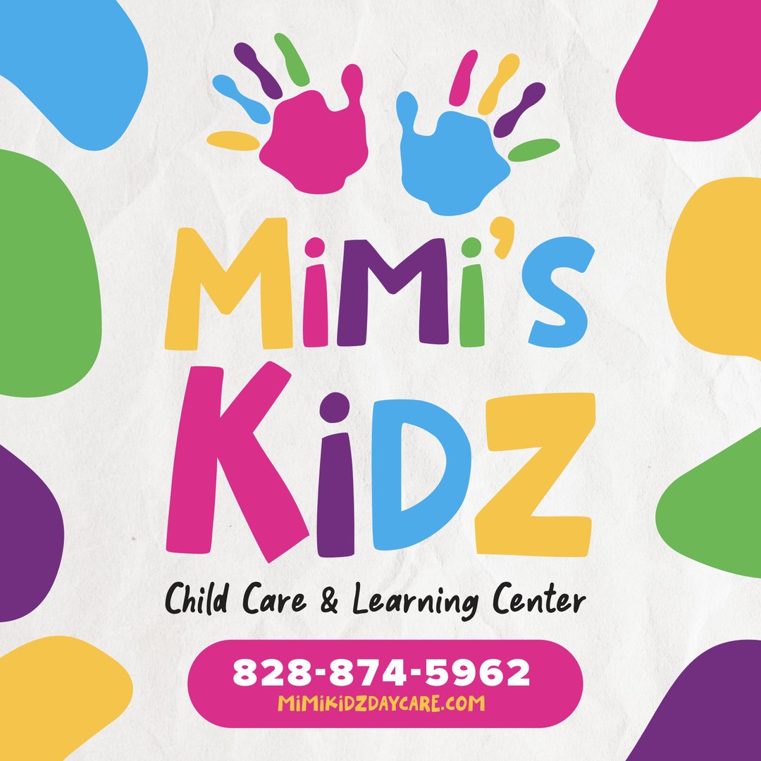
Our team was stoked to partner with the new Morganton Coworking space, MOCO, on their brand identity. VNM's strategic and creative teams collaborated with the MOCO Advisory Committee to develop the name, tagline, logo and graphic standards for this exciting new space coming to downtown Morganton!
VNM was delighted to partner with a new client and old friend to develop the brand identity for CC Storage, a new climate-controlled, self storage facility coming to Hickory, NC. The brand features a unique font and custom graphics inspired by a box and the iconic self-storage roll up metal doors.
VanNoppen Marketing was delighted to be chosen to develop the new mascot logo for NCSSM-Morganton: Home of the Dragons. Our creative team worked with NCSSM staff and students to create a fierce dragon logo to represent the school's fiery new mascot.
Naturally, VanNoppen Marketing was thrilled to develop the branding for local startup, The Paper. A community-owned local newspaper, The Paper's new logo incorporates historic buildings from downtown Morganton with a bold modern serif font.
After partnering with Gray Stout on our new office design, VanNoppen Marketing was delighted to assist Gray in developing a new brand for Stout Studio Architecture. We designed a clean, type-based logo and brand package that included business cards, letterhead, envelopes, email signature and other print materials.
Our team was stoked to team up with local start-up Maia Stave on their new branding. As wine stave and outdoor furniture retailer, the logo includes a drawing of a wine barrel in the making placed in-between a modern, elegant font that is streamlined for use as a wood-burned stamp.
Longtime client Black & Associates decided it was time for a new brand and tapped the VNM team to design a new logo. Together with our friends at Table Rock Printers, we created letterhead, envelopes and other marketing materials to show off their new look.
Our team was delighted to develop a logo and marketing materials for Burke Primary Care's second location - Burke Sports & Family Medicine.
We were stoked to partner with Catawba Brewing and Oyster City Brewing on the brand identity for their parent company, Made by the Water! Our team designed a contemporary logo package with a clean aesthetic for MBTW to use as it makes moves in the beer scene up and down the Southeast.
Our team had a blast partnering with dear friend and steadfast HR consultant Janna Kropelnicki on a new logo and brand identity for Kropelnicki HR! After lots of back and forth about the big K, we landed on a professional and unique look to carry the business into its next chapter.
VanNoppen Marketing designed and developed a new brand package for Biltmore Family Office that conveyed BFO's professionalism while retaining the unique symbology of their roots. Brand guidelines, marketing collateral, presentation templates, signage, office merch and dog bandanas followed suit.
VanNoppen was honored to partner with our neighbor, Thornwell Books, a bookstore and coffee shop in downtown Morganton, on their branding package and merch designs.