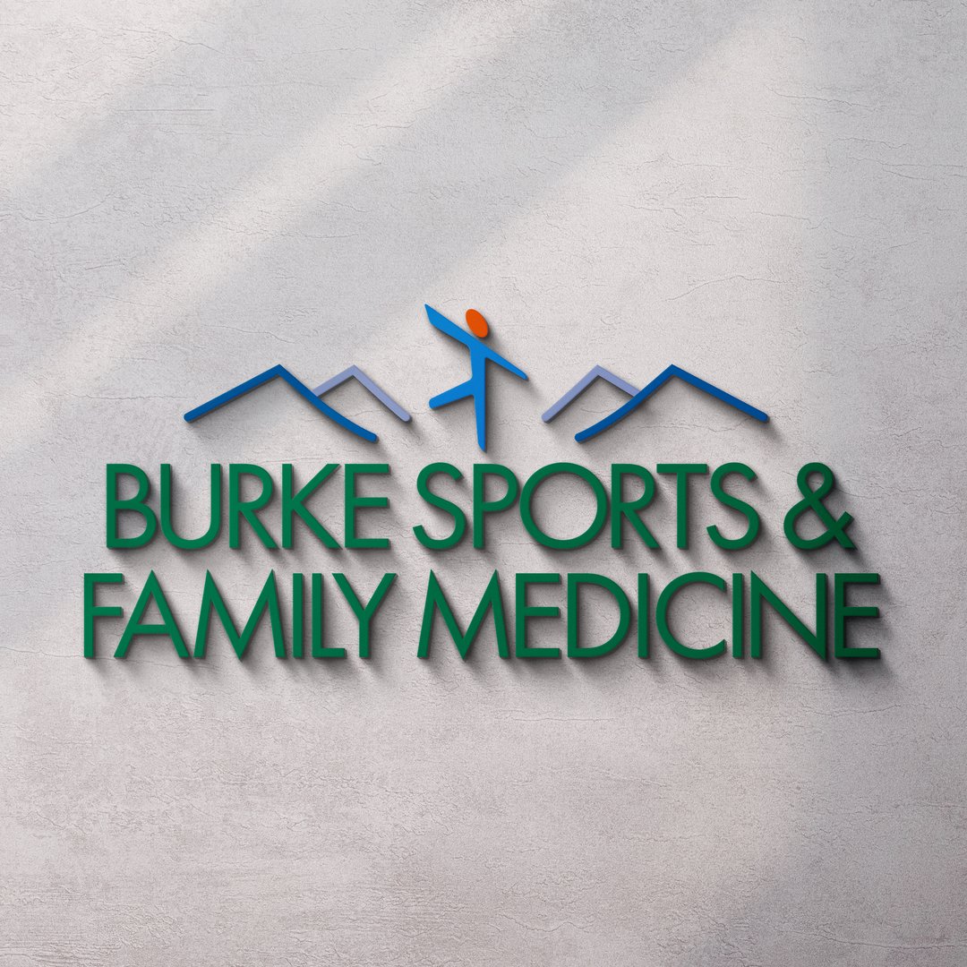
VNM worked with parent company, Burke Primary Care, on name strategy and logo design for their new Sports Medicine location. The new brand features a color scheme, font family and general aesthetic that clearly conveys its connection to the parent brand.
Logo Package
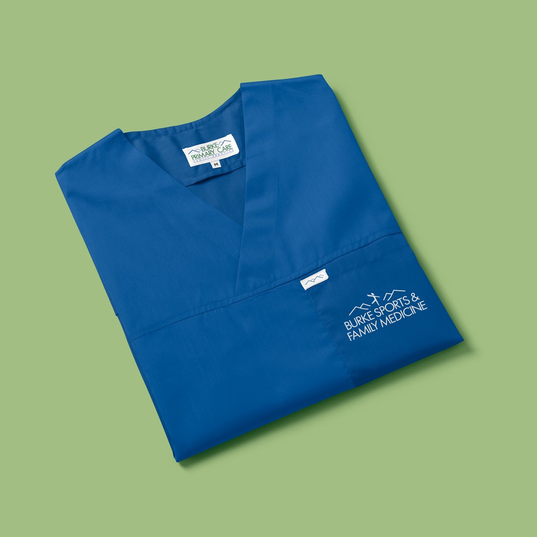
Logo variations included single color, white, icon and stacked logo files for use across print and digital marketing materials, signage, merchandise, scrubs and more.
Appointment Cards
A further nod to parent Burke Primary Care, VNM designed an appointment card matching those used at the main location with the new Sports Medicine branding.
Patient Portal Flyer
VNM designed an informative flyer about the online Patient Portal to be given out to patients visiting the new Sports Medicine location.
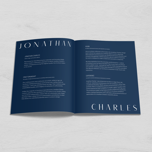
Markor tapped VanNoppen Marketing to developing a new brand for their most recent furniture acquisition, Jonathan Charles. A fine furniture maker catering to the high-end marketplace, Jonathan Charles needed a luxury aesthetic coupled with a distinct look. VNM delivered with distinct brand identity and supporting suite of assets.
In conjunction with a custom website, VanNoppen developed a new visual brand identity for Surry Scenic Bikeway, over 500 miles of designated cycling routes through Yadkin Valley wine country in North Carolina.
Visit Little Switzerland’s previous logo was outdated and did not capture the essence of the community. VanNoppen Marketing created a new brand that is modern, appealing to dynamic audiences, and conveyed the unique location on the Blue Ridge Parkway. A supplementary brand guidelines package with fonts and colors helps member businesses and community partners keep branding consistent.